Aura’s radiant maqui berry facial serum
overview
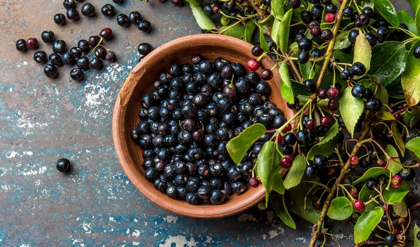
Maqui berries, native to South America, are known for their high concentration of antioxidants and have long been valued for their restorative properties. In skincare, they have gained attention for their potential to support skin vitality and address visible signs of aging.
This project explores how these benefits can be translated into a refined, luxury-focused serum, positioning maqui as both a functional ingredient and a central element of the brand narrative.
challenge
Define a luxury face serum that stands out within a saturated beauty market through refined visual identity, ingredient storytelling, and elevated brand positioning.
tools used
Adobe Illustrator, Adobe Photoshop, Adobe Fresco
timeframe
1 week
Research is a key part of my design process, providing the foundation for more intentional and informed creative decisions. For this project, I explored maqui berries as both an ingredient and a narrative anchor.
Known for their high concentration of antioxidants, maqui berries have been associated with a range of potential skincare and wellness benefits, including support for skin vitality and visible signs of aging. Additional research also highlights broader health associations such as cardiovascular support, blood sugar regulation, and gut health.
Notes on process

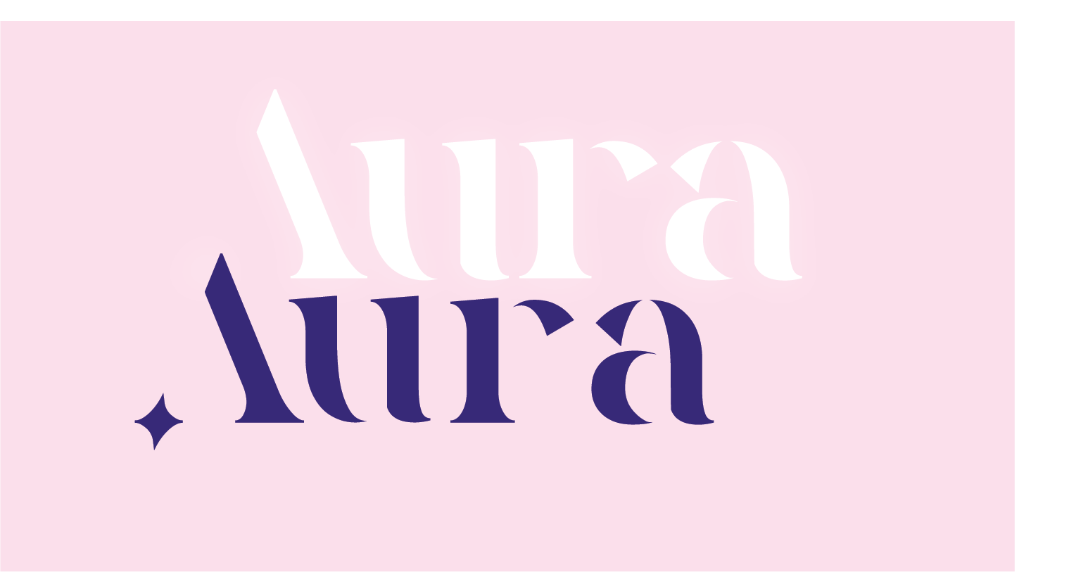
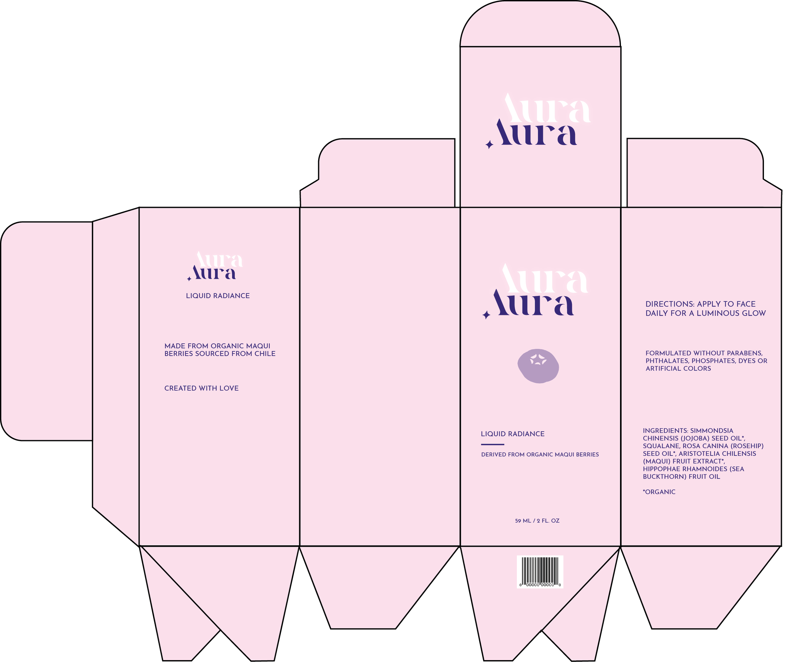
Original font - Quakiez
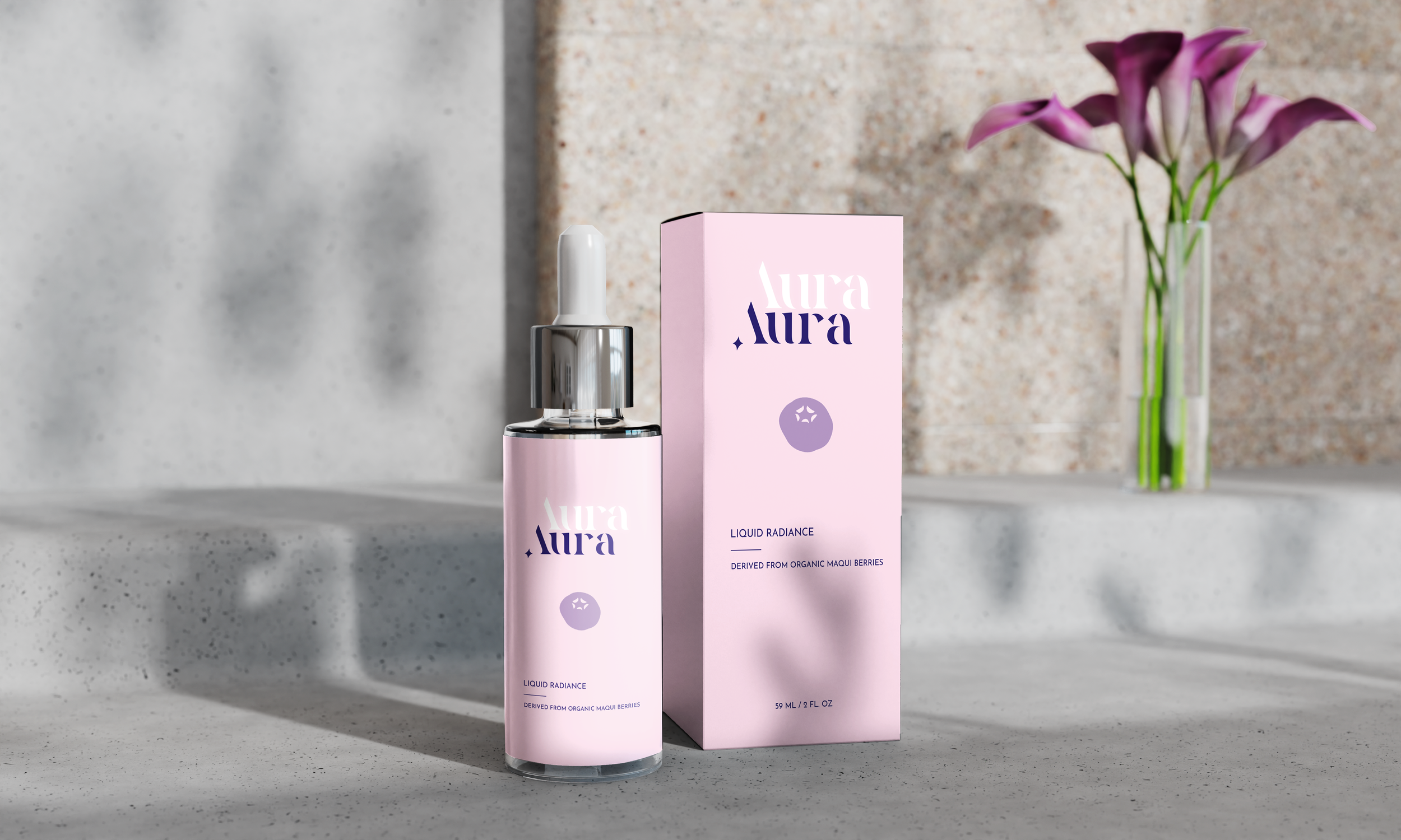
The packaging design introduces an organic sensibility through a hand-rendered illustration of the maqui berry, reinforcing the ingredient-led nature of the product. This approach aligns with consumer expectations in the beauty space, where authenticity and natural cues play a key role in perceived efficacy and trust.
The overall visual language is understated, with a subtle sense of luminosity to reflect the serum’s intended effect. Typography is based on Quakiez, customized to introduce a refined sparkle detail in the “A,” referencing the product’s glow while maintaining a minimal luxury aesthetic.
A soft, restrained color palette reinforces the premium positioning, with berry tones derived directly from the primary logo color to ensure cohesion across the system. The final dieline for the serum box translates this identity into a production-ready packaging structure.
solution
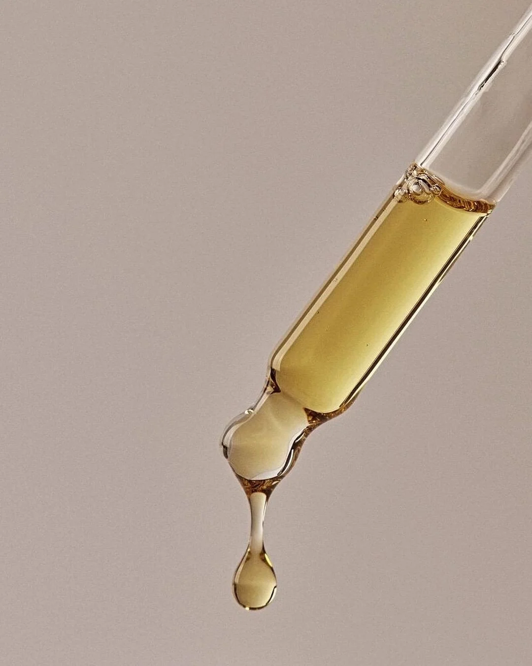
Aura is a facial serum centered around maqui berry, a nutrient-rich superfruit known for its high antioxidant content and restorative properties. The product is designed to support radiant, healthy-looking skin through an ingredient-led approach that highlights the natural potency of its core component.
The brand positions skincare as a ritual rooted in nature, translating the concept of luminosity into both its formulation narrative and visual identity.