Tiny Tides Chocolate - Packaging and Brand System

overview
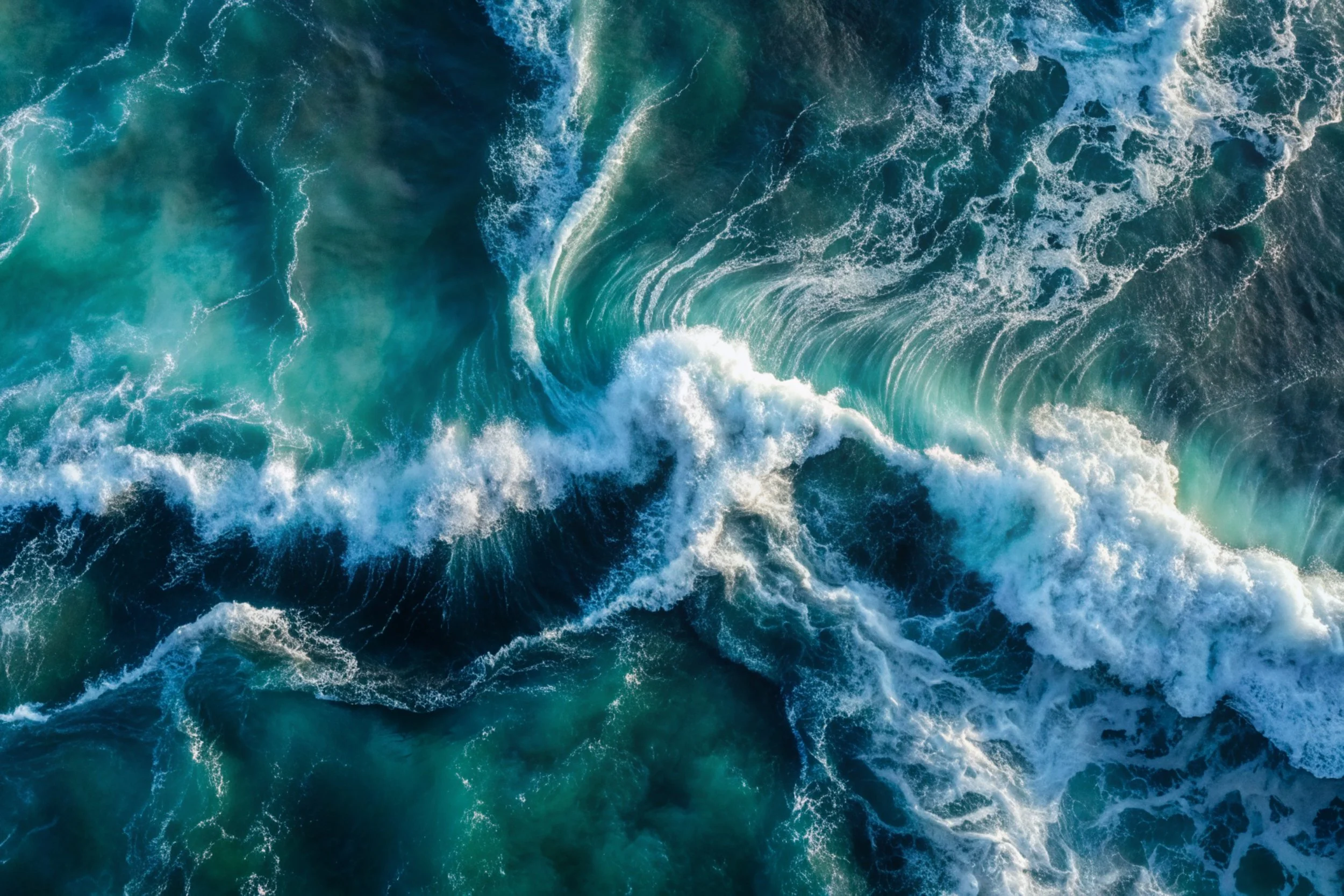
Sumatra is losing its rainforest at one of the fastest rates in the world—mostly due to unsustainable agriculture. At the same time, our oceans are drowning in plastic.
Tiny Tides Chocolate addresses both issues in a single, delicious product that consumers can feel good about. We highlight specific creatures from both land and sea that are either endangered or vulnerable, and donate to Sumaterra to protect our essential oceans and rainforests.
I led the creative direction for this concept-driven chocolate brand centered on the intersection of ocean conservation and rainforest ecosystems. I developed a packaging system that visually merges these environments using layered photographic compositions and blend modes, creating a surreal, unified world.
Translated the concept into a cohesive set of packaging assets, balancing expressive visuals with clear hierarchy and shelf presence. Considered materiality and production techniques to support both sustainability goals and a premium tactile experience.
challenge
Develop a socially conscious chocolate brand, including visual identity, packaging design, and production-ready dielines. Create a cohesive product line featuring three distinct flavors.
tools used
Adobe Photoshop, Adobe Illustrator, Figma
time period
10 weeks
The final packaging
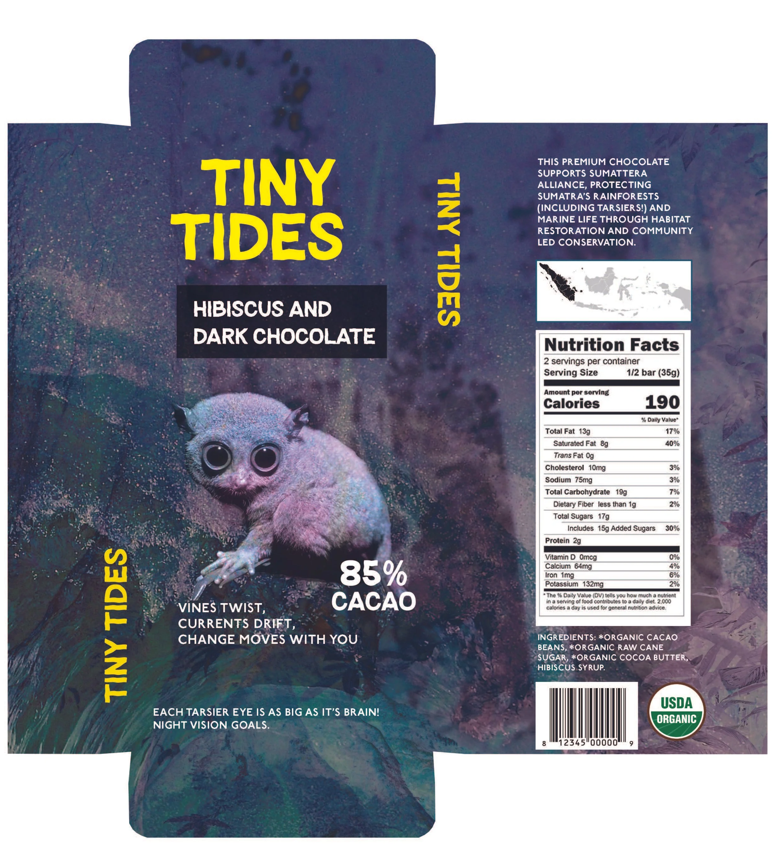
Hibiscus & Dark Chocolate
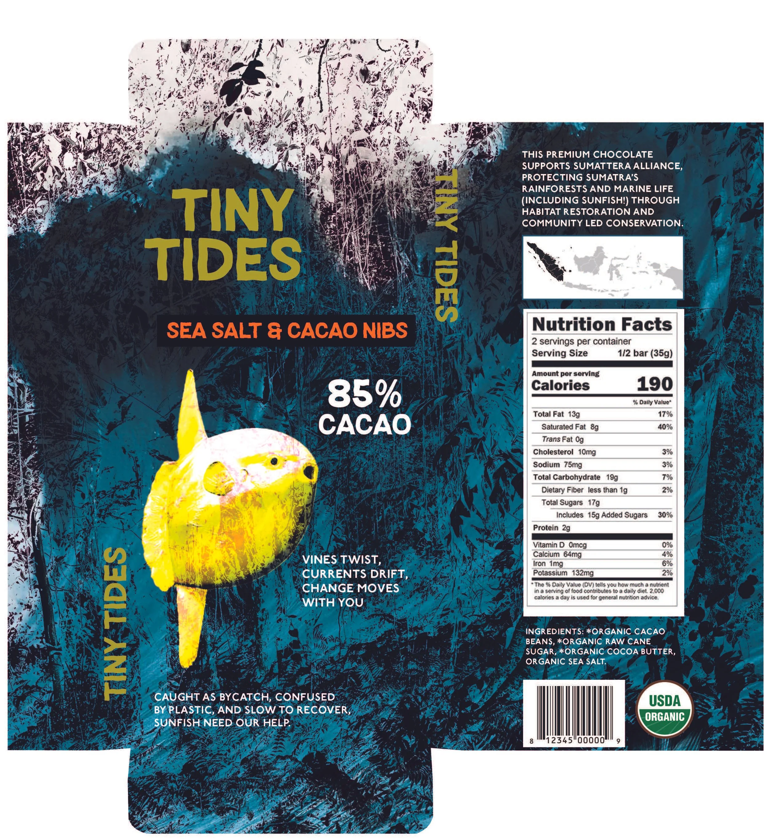
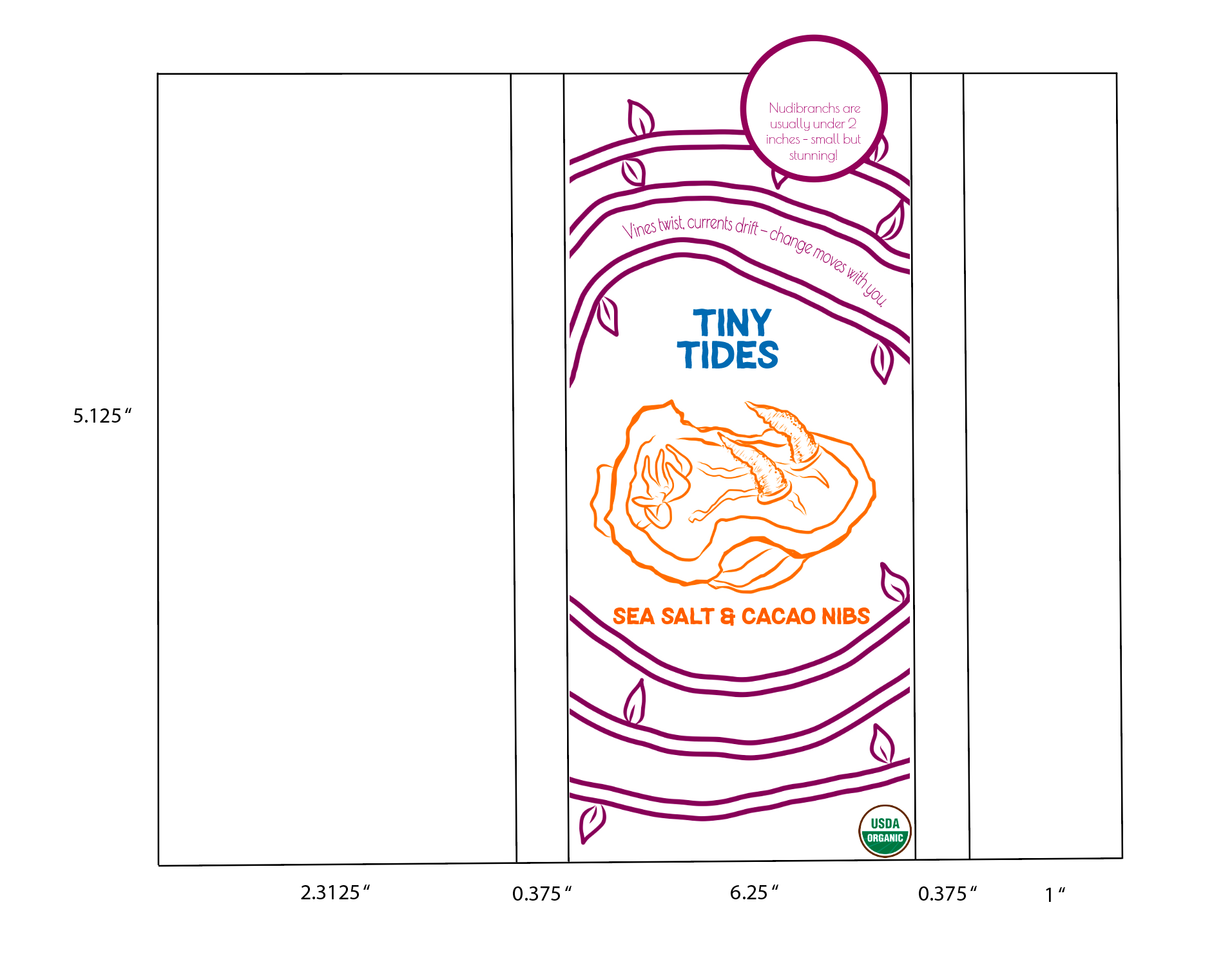
Sea Salt & Cacao Nibs
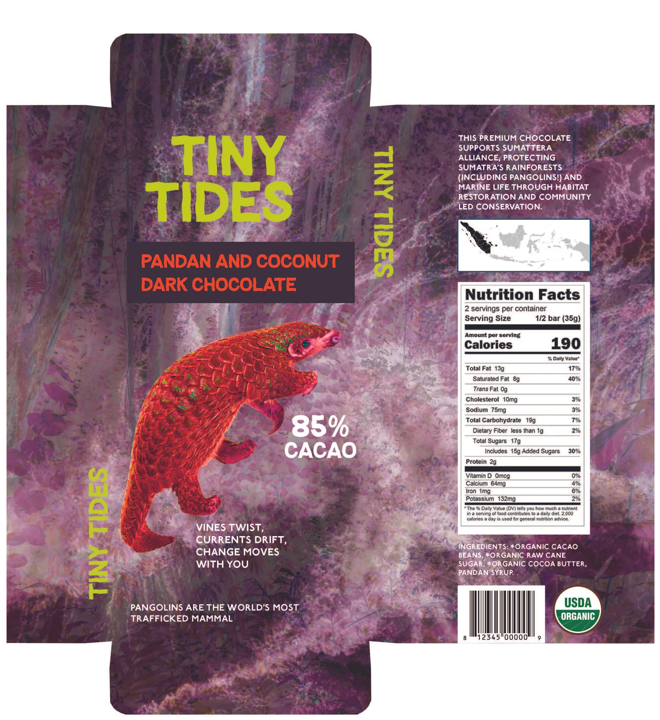
Pandan & Coconut Dark Chocolate
Location
Background
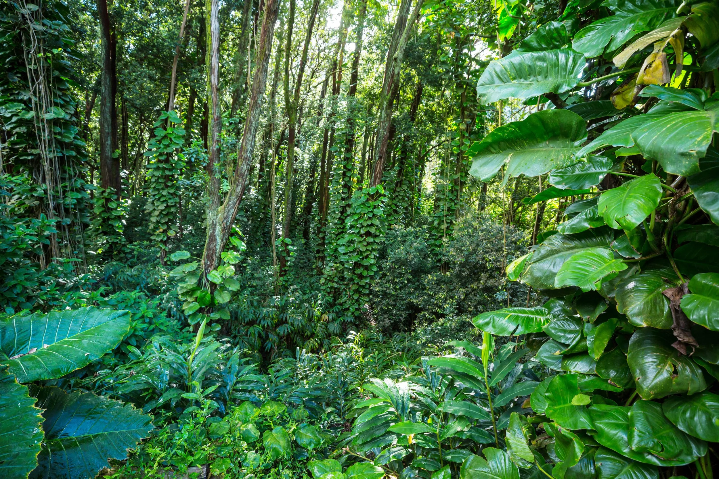
The project focuses on the Sundaland region, one of the world’s largest and most biodiverse rainforest ecosystems, encompassing Borneo, Sumatra, and Java.
Despite its ecological significance, Sundaland has experienced some of the highest rates of primary forest loss globally, with significant declines driven by oil palm and timber production, as well as land-clearing fires.
The surrounding marine environments are equally rich in biodiversity, reinforcing the region as a critical intersection between rainforest and ocean ecosystems—an alignment that directly informs the brand’s concept and visual direction.
Flavors
Our core flavors connect land and sea, and incorporate local ingredients:
Hibiscus & Dark Chocolate – a nod to rainforest flora
Sea Salt & Cacao Nibs – representing ocean minerals and texture
Pandan & Coconut – inspired by Southeast Asian plants
Future limited editions will feature new rainforest-ocean pairings to keep the product fresh and tell evolving stories.
Packaging
The packaging was designed with sustainability at its core, using fully biodegradable and compostable materials. Natural inks were selected to minimize environmental impact and prevent waterway pollution.
Material choices intentionally reflect the brand’s dual-ecosystem focus: a bamboo exterior paired with a scentless seaweed-based inner layer. This combination not only reinforces the connection between rainforest and ocean environments, but also eliminates the need for traditional paper substrates, reducing reliance on tree-based materials.
Notes on the process
The visual direction evolved significantly over the course of the project while the core concept remained consistent. Early explorations focused on illustrated assets and smaller-scale packaging, but the approach shifted toward a more immersive and refined system using photographic elements and Photoshop blend modes.
This transition allowed for greater depth, realism, and cohesion across the packaging, ultimately strengthening the connection between ocean and rainforest imagery at a larger, more impactful scale.

Chocolate packaging inspiration moodboard

Natural inspiration moodboard
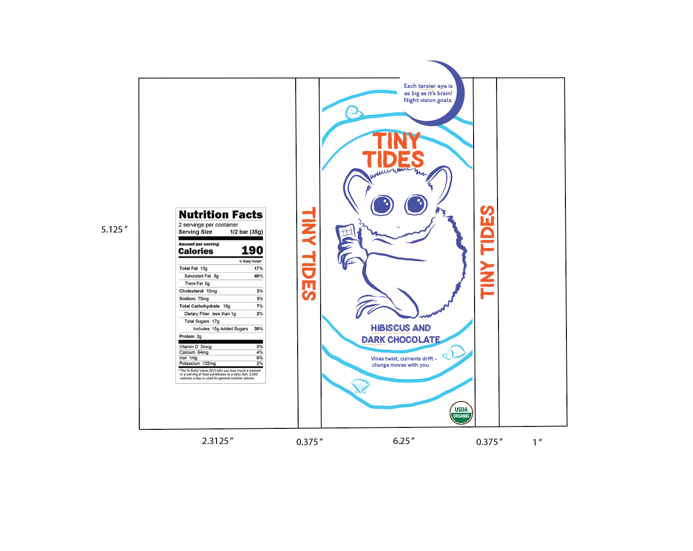
Early iteration of packaging

Early iteration of packaging
Early iteration of packaging

Early iteration of packaging
I developed a visual system using Photoshop blend modes to integrate ocean and rainforest imagery within each composition. This approach allowed for seamless layering of environments, reinforcing the concept of ecological interconnectedness.
Each flavor variation utilized a distinct combination of blend modes, creating unique visual outcomes while maintaining overall cohesion across the system. The pangolin iteration demonstrates how these layers were built and refined to achieve the final result.
Luminosity
+
Process in Photoshop
Exclusion

Normal
+
=
solution
Tiny Tides is positioned as more than a product—it is a brand built around small actions driving meaningful environmental impact. By visually and materially linking rainforest and ocean ecosystems, the packaging and sourcing strategy work together to reinforce a unified conservation narrative.
The brand invites consumers to participate in this mission through an accessible, everyday purchase, transforming a simple moment into a point of connection and awareness. Educational elements are integrated directly into the packaging, with each bar featuring a fact about the species represented, extending the experience beyond consumption.
The tagline, “vines twist, currents drift, change moves with you,” encapsulates the idea that incremental choices can create far-reaching impact.